This item is adapted from the July 3 Texas A&M—AgriLife Agronomic Monday Memo (TAM-AAMM).
Calvin Trostle, Ph.D., Professor & Extension Agronomist, TAMU Dept. of Soil & Crop Sciences, Lubbock, (806) 746-6101, ctrostle@ag.tamu.edu
A bird’s eye view of drought conditions in your general area
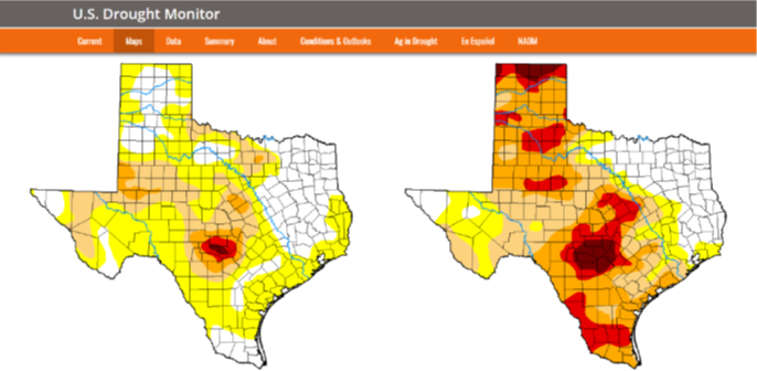
Fig. 1. Comparison of Texas drought conditions on June 27, 2023, versus an earlier date of your choice (here three months earlier, March 28, 2023). Statistics give the percentage of each drought category. This side-by-side comparison of dates is one of many functions of the U.S. Drought Monitor. To access this side-by-side comparison, on the main page choose Maps then ‘Compare Two Weeks’ then for Area Type (default is National) choose ‘State’ then from the Area menu scroll to ‘Texas’. Then choose the dates to compare.
Most of us have the seen the yellow, tan, orange, red, and maroon maps of the U.S. or Texas reported by the U.S. Drought Monitor (USDM). Many of us place USDM images in our newsletters, PowerPoints, and other writings. These maps show various levels (or lack of) drought. But what do the colors mean? Who decides, or what data is used to make these maps?
This is a description of USDM and some additional tools that Extension and other agriculturalists can use to understand your current regional conditions, recent changes, and when we might shift programming efforts to respond to increasing drought.
From USDM: Maps are released every Thursday (http://droughtmonitor.unl.edu) showing where drought is and how bad across the U.S. The map uses six classifications:
- .Normal conditions
- Abnormally dry (D0), showing areas that may be going into or are coming out of drought
- And four levels of drought:
- Moderate (D1)
- Severe (D2)
- Extreme (D3)
- Exceptional (D4).
How do we know we are in a drought?
More from USDM: “When you think about drought, you probably think about water—or the lack of it. Precipitation plays a major role in the creation of the Drought Monitor, but the map’s authors consider many data sources. Numeric inputs include:
- Precipitation
- Temperature and water evaporative demand
- Soil moisture
- Streamflow (much of West Texas has no streams!)
- Reservoir levels
- Vegetation health
No single piece of evidence tells the full story, and neither do strictly physical indicators. That’s why the USDM is not a statistical model. It is a blend of these physical indicators with drought impacts, field observations and local insight from a network of more than 450 experts.
Caveats on Using the U.S. Drought Monitor
The USDM provides a consistent big picture look at drought conditions in the U.S. on a national, regional, state, and even county level. Although it’s based on many types of data, including observations from local experts, be cautious about using it to infer specifics about local conditions. My estimate is the scale of conditions is probably about 10 miles. So that may not be specific to an individual farm or ranch.
“I received 4” of rain in the past two weeks. My crops look OK now and pastures are recovering. Why am I still in moderate or severe drought?”
Drought conditions develop slowly. It takes weeks and even months for soil moisture to deplete, stream flow to cease, etc. In the same way, one does not exit drought quickly (unless you get 6 or more inches of rain that restores conditions quickly). I was initially puzzled by this. But in my example above the farmer/rancher is still likely vulnerable to severe and worse drought conditions if it rains no more and it gets hot. He/she has not yet built up the buffer needed to avert crop, pasture, and livestock stress.
Other Uses of the U.S. Drought Monitor
- County Level Drought
When you pull up a state map, move your cursor over your county (which highlights) and click (Fig. 2). This gives you county information. See the example below for Hays Co., Texas. This county south of Austin has four levels of dry/drought as of June 27, 2023.
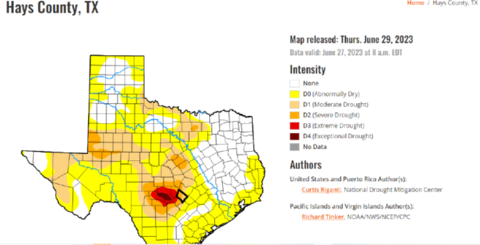
Fig. 2. Highlighting an individual county will provide county level drought conditions (statistics appear in the web window below this screen shot).
- Monthly outlook looking forward for predicted and potential changes in drought status.
USDM also combines current data with predicted conditions to estimate the increase or decrease for the U.S. Of course, this is a prediction—based on probabilities (Fig. 3). Local and regional conditions may not follow predictions.
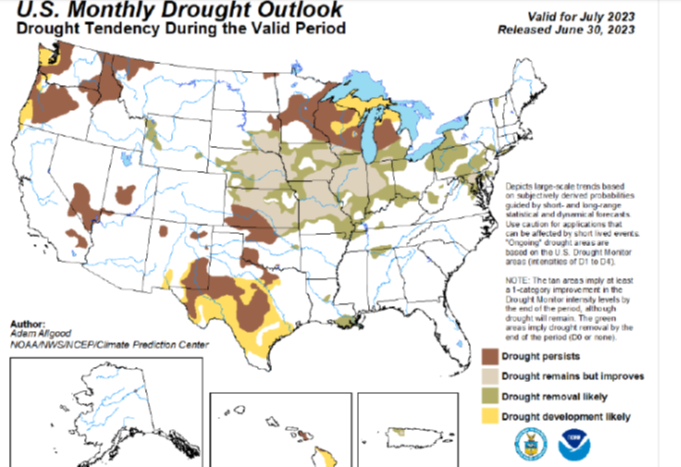
Fig. 3. Predictive possible change in drought conditions for the next 30 days. This information is also available through the U.S. Drought Monitor. From the main USDM webpage click on ‘Conditions and Outlook.’
- S. Agricultural Commodities Affected by Drought—How much impact?
To what extent are current U.S. drought conditions affecting agricultural commodities for row crops, livestock and forage, and specialty crops? This additional information is perhaps more of interest to those in marketing and predicting grain, livestock, and vegetable/fruit supplies (Fig. 4). From the main USDM webpage choose ‘Ag in Drought’ then select your commodity of interest.
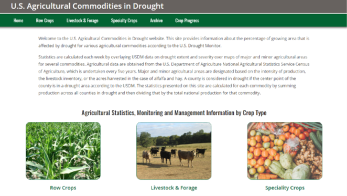
Fig. 4. Webpage interface for information on drought impacts on agricultural commodities. Each category provides specific numbers for row crops (13), livestock and range (6), and specialty crops like oranges or numerous vegetables.
The commodities drought information through late June 2023, for example, notes 41% of the U.S. livestock inventory is in areas affected by drought. And 55% of the grain sorghum acreage (existing crop or to be planted) is in drought. But just 5% of U.S. national peanut acreage is currently in drought.
** ** **
The USDM is a collaborative effort of USDA, the National Drought Mitigation Center (Univ. of Nebraska), and the U.S. Dept. of Commerce/National Oceanic and Atmospheric Administration.